14/04/2023 • Blog, Design Tips
7 Expert Design Ideas for Galley Kitchens
Estimated Read Time: 5 minutes
What makes the world of kitchen design so interesting is that every kitchen’s layout is different!
While the contemporary open-concept kitchen has been all the rage in recent years, that layout certainly isn't practical for every home. Sometimes creating the perfect kitchen design that fits your home can feel so much more rewarding than knocking down walls and going through a full-fledged "gutting" of a renovation.
That's where the galley kitchen comes in!
At Deslaurier, we have over 40 years of experience providing our clients with custom cabinets and kitchen design services. In that time, our in-house designers have crafted kitchen designs to fit every layout imaginable.
This article will provide 7 design tips to create the perfect galley kitchen with Deslaurier design consultant, Alanna Wharton, offering her expertise along the way!
Let’s get started!
|
Table of Contents |
What is a Galley Kitchen?
A galley kitchen is a long, narrow kitchen layout characterized by having two parallel walls of kitchen cabinets.
This kitchen layout gets its name from the cooking area on a large ship, known as a galley. A ship's galley is known for providing optimal function and efficiency within a limited space. They are also referred to as “corridor” kitchens, due to the long and narrow space feeling like a corridor.
Galley kitchens are a common layout for apartments or smaller homes where a more spacious open-concept or L-shaped kitchen design isn’t ideal.
“To me, a galley kitchen means you’ve got two runs of cabinets and the space in between is that minimum clearance with no room to include an island.” - Alanna Wharton
With that, let's dive into 7 tips to enhance your galley kitchen design!
1. Light and Bright Colour Scheme
Keeping the kitchen bright by using light colour schemes is one of the most tried and true methods of increasing the visual appearance of a smaller space.
Incorporating gentle colours such as white or light grey for the wall paint, kitchen cabinets, and countertop surfaces will make the space feel larger and more open.
The same goes for flooring! Choosing light-coloured flooring, such as paler wood species (birch or white oak) or tile, to help give the illusion of a larger kitchen space.
When it comes to flooring, it's not only the colour that has an impact but the size and shape as well. Substantial 36” by 36” tile flooring can do wonders to expand the visual space of your kitchen. With hardwood, opting for a trendier wide plank can do the same.
2. Add Some Open Shelving
Replace upper wall cabinets with shelving to create a more open and airy feel.
While floating shelves can be implemented in any kitchen, they are especially great for small kitchen designs. They provide convenient storage and decoration with immediate access and maximize the upper walls of a smaller kitchen.
That’s what makes floating shelves so preferable in smaller kitchens: they make the most of your available space!
“If it feels like a tight, small space, that’s one way to make the room feel larger and lighter” - Alanna Wharton
This will also allow you to proudly display your favourite kitchen items or add some warmth with personalized decoration.
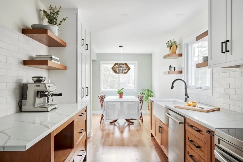
Take a look at this galley kitchen Alanna Wharton designed that includes six(!!) floating shelves to expand the visual weight of the upper walls:

Further, installing floating shelves beside a window (as seen above) is a highly popular way to implement them into a kitchen design.
Putting shelves next to a window allows more light into the room, as opposed to a deep cabinet box. This light brightens up the kitchen while also providing sunlight to any plants or herbs you may have ornamenting your shelves.
3. Lighting
Speaking of lighting, it’s one of the most unsung elements of a kitchen design.
Adding lighting is typically one of the last phases of a kitchen renovation project, but an important one that can be thought about as you work through your plan.
“A galley kitchen is oftentimes narrow and small, so you just want the lighting to make it feel bigger and brighter” - Alanna Wharton
Use lighting to brighten up the counters and create a more welcoming atmosphere.
When it comes to aesthetics, lighting is one of the most effective ways to energize a kitchen. It can impact the colour, look, and ambiance of the room. Whether its with pot lights or localized under-cabinet lighting, proper lighting can enhance any kitchen.
That goes for natural lighting, too! The floating shelves example above is a great method of increasing the amount of natural lighting available to a kitchen. The sleek and open shelving allows far more of the window's natural lighting to enter the kitchen than you'd normally get with two cabinet boxes in their place.
4. Reduce the Depth of one Wall
Finding ways to enhance the amount of usable space is one of the key challenges (and triumphs) in a galley kitchen design.
If you can, decreasing the depth of a few cabinets can go a long way in that regard.
“It all depends on the clearance you have and the width of the overall space” - Alanna Wharton
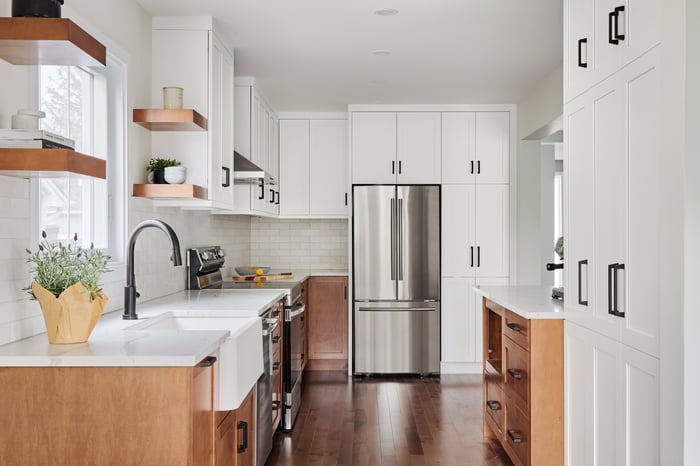
Take a look at how Alanna worked with different depths of cabinetry in her Transitional in Toscano showcase, for example:

Notice the full-height pantry unit using shallower depth cabinets. This allows for better flow into the kitchen and more clearance for the farmhouse sink directly behind it. As you can see, the rest of the kitchen wasn't short on cabinetry storage, which made reducing the depth of the wall-unit was manageable.
5. Spacing Out the “Zones”
It’s vital to ensure your kitchen's appliances and workstations have as much room as possible for function and efficiency. That’s especially true when talking about the parallel-wall design of a galley layout.
The last thing you want is for crucial areas in the kitchen to be backing onto one another. This will hinder the ability for multiple people to be in the kitchen at the same time, let alone work together.
The best way to achieve that? Stagger your zones!
“Stagger kitchen workstations so something like your sink is not directly behind your oven.” – Alanna Wharton
If someone’s working on one side, there’s room and clearance for someone else to work behind them, or simply just walk through the kitchen in comfort.
Particularly with units like refrigerators, ovens or dishwashers, that might need significant clearance for their doors. Making sure no other crucial element is directly behind them will make your kitchen run as smooth as possible.
6. Include Two Entrances
Galley kitchens can be designed in one of two ways. Firstly, as a “dead-end” where there is only one way in and out. This design will reduce foot traffic, but will also add an extra wall to your kitchen space.
The second is a “pass-through” galley kitchen, which creates a corridor design.
A pass-through galley kitchen will have two entrances on opposite ends of the layout. This design allows you to “pass through” the entire kitchen, a valuable addition that increases the functionality of overall foot traffic.
This is ideal for larger layouts, as the second door or opening will slightly decrease the amount of usable wall space in your kitchen design. However, if you have the space needed for a second entrance, you’ll love the way it improves your kitchen’s mobility.
7. Hide Your Appliances
Lastly, design your appliances to be built-in with your cabinetry and be flush with the countertop.
“Hide your appliances. That’s a good tip for any kitchen, but specifically in a small kitchen like a galley where you don’t want to feel appliances stick out past the countertop.” - Alanna Wharton
Standard appliances will protrude roughly 3 inches past your countertop. While that may not sound like a lot; if your design has appliances on both walls, that can add up to half a foot of appliances being exposed in the kitchen area.
Built-in and integrated appliances will reach the countertop depth and not surpass it. Saving you valuable kitchen space. Not to mention the ability to seamlessly integrate them into your cabinetry design with overlay paneling.
Design with Deslaurier Custom Cabinets
With such a unique space, it’s important you maximize the functionality and appearance of your galley kitchen. We hope this article gave you inspiration for your current (or future) galley kitchen layout.
If you have your eye on custom cabinetry, Deslaurier Custom Cabinets has everything you need. With over 40 years of experience in our name, we provide our clients with a fully customized design process with our talented team of designers.
Book a free consultation with a Deslaurier kitchen expert at our Jupiter, Florida showroom!
Live outside the area? Find a Dealer to connect with a Deslaurier dealer near you! Are you interested in becoming an authorized Deslaurier dealer? Visit our Become a Dealer page to learn more!

